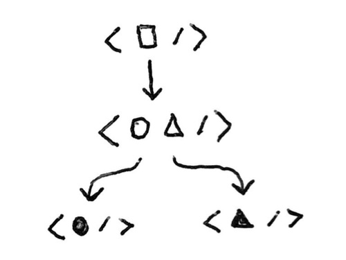
TL;DR:Using a generic HOC creator pattern, I can compose two React components together in a highly decoupled way. The pattern is to create a HOC (Higher-Order Component) creator function, which can be applied to a general component by a combined components and exported for re-use by consumer components. Examples of applications include Tooltips and Form controls.
I've recently developed a pattern that allows me to compose two React components together in a highly decoupled way, using a generic HOC creator.
In this article I'll motivate and outline the pattern, provide an example, and discuss my own implementation, createWithHOC.
Motivation#
Suppose we have an extremely general component, which we want to widely re-use by connecting it to other components in our component library.
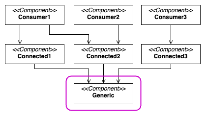
We are happy for the immediate consumers of the component need to know about the general component.
But we don't want their consumers – the end consumers – to know about it.
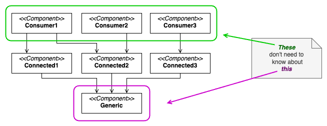
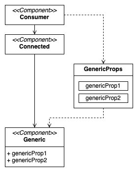
For these end consumers, we just want to expose some special props, which will ultimately be passed through to the general component.
Pattern#
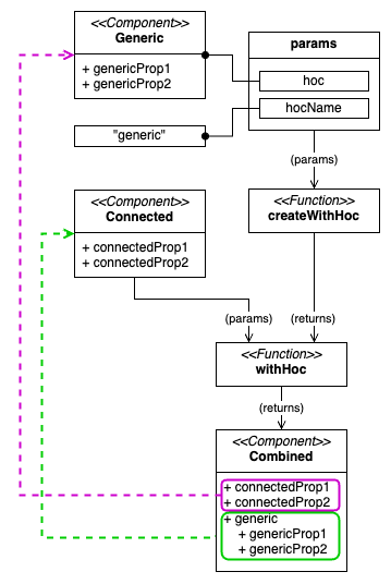
The pattern here is to create a HOC (Higher-Order Component) creator function, which can be applied to the general component by the combined components and exported for re-use by the consumer components.
- The HOC creator function is called and passed the general component as a parameter, along with a string descriptor (more on that later).
- Its result is a HOC, which is exported. This exported HOC allows the general component to be combined with another component.
- One or more other components call this HOC, to combine themselves with the general component.
- Its result is a component which has almost identical props as the combined component, except that it includes one additional prop. This additional prop, named by the string descriptor from step 1, contains the props to be passed to the general component.
Example#
Let's look at a realistic example to see how this pattern can be applied.
Suppose we have a Tooltip component, which takes a children prop and a contents prop. The children prop will have the component that triggers the tooltip. The contents prop will have the component that should be shown inside the tooltip.
interface TooltipProps {
  readonly children: ReactNode;
  readonly contents: ReactNode;
}

export function Tooltip(props: TooltipProps) {
  // ...
}
Now in our component library, there are several different components that might all need to have a tooltip.
For example:
- Button
- Checkbox
- Image
For each of the above three components, we want to allow their consumers to provide an optional tooltip. But we don't want to couple these three components too closely to the Tooltip component. And we want the re-use of the Tooltip component to be as easy and straight-forward as possible.
First, in our tooltip.tsx file, lets create and export an HOC that exposes Tooltip in a re-usable manner:
export const withTooltip = createWithHOC(Tooltip, "tooltip");Notice that createWithHOC doesn't know much about Tooltip. It just receives its definition and a string descriptor - "tooltip". However, what it returns - withTooltip - is very useful.
Here's a simple implementation of our Button component:
interface ButtonProps {
  readonly children?: ReactNode;
  readonly onClick: VoidFunction;
}

export const Button_ = (props) => {
  return (
    <button onClick={props.onClick}>
      {props.children}
    </button>
  );
};

export const Button = withTooltip(Button_);
If we were to consume Button directly, without the withTooltip wrapper, it would have the children and onClick props, as we would expect.
However, with the withTooltip wrapper call, Button is now augmented with an additional tooltip prop. (Named by the string "tooltip", which we originally passed to the createWithHOC call in our tooltip.tsx file).
So now the props of Button_ look like this, from a consumer's point of view:
// Note: Fictitious interface name.
// This is just the un-named type of the props parameter of the
// `Button` component exported in the previous code sample.
interface ButtonProps {
  readonly children?: ReactNode;
  readonly onClick: VoidFunction;
  readonly tooltip?: TooltipProps;
}
So when we consume Button, our code can look like this:
const Item = () => {
  return (
    <Button
      onClick={handleDeleteClick}        // <-- <Button_> props
      tooltip={{ contents: "Delete" }}   // <-- <Tooltip> props
    >
      🗑️
    </Button>
  )
}
This will have the same net effect as if we had consumed Button_ directly, wrapped in Tooltip, passing the appropriate props to each.
const Item = () => {
  return (
    <Tooltip contents="Delete">
      <Button_ onClick={handleDeleteClick}>
        🗑️
      </Button_>
    </Tooltip>
  )
}Advantages#
I found three advantages of using this pattern, where applicable:
- Smaller consumer code
- Aesthetically pleasing consumer code
- Ability to constrain re-use of general components
Smaller consumer code
Consumer code is significantly smaller and less indented, as we are relying on props rather than nesting. This benefit can add up quickly when, say, rendering multiple instances of the same component type side-by-side.
Here's an example of multiple buttons with tooltips:
const Item = () => {
  return (
    <>
      <Button onClick={handleDeleteClick} tooltip={{ contents: "Delete" }}>
        🗑️
      </Button>
      <Button onClick={handleEditClick} tooltip={{ contents: "Edit" }}>
        📝
      </Button>
      <Button onClick={handleCopyClick} tooltip={{ contents: "Copy" }}>
        📑
      </Button>
    </>
  )
}
Aesthetically pleasing consumer code
Consumer code is also more aesthetically pleasing, when relying on props. It presents as a cleaner, more compact and concise list of components.
Here's an example, in which we render different kinds of form controls side-by-side.
Using the generic HOC pattern, each form control is passed a prop to configure one or more of:
- A label
- A default
- Validation logic
const Item = () => {
  return (
    <>
      <TextInput
        name="firstName"
        label={{ contents: "First name" }}
        validation={{ required: true }}
      />
      <TextInput
        name="lastName"
        validation={{ required: true }}
      />
      <DateInput
        name="dob"
        label={{ contents: "Date of birth" }}
        validation={{ required: true, maxDate: nowMinus18Years }}
        default={{ value: nowMinus20Years }}
      />
      <Checkbox
        name="registerForUpdates"
        label={{ contents: "Register for updates" }}
      />

      <Button type="Submit">
        Submit
      </Button>
    </>
  )
}
All controls appear at a consistent level of indentation and so do their props. This is easier to read and more aesthetically pleasing than if each control was nested in a different set of containers (validation, etc) and appeared at inconsistent levels of indentation.
Ability to constrain re-use of general components
An additional advantage of this pattern is that we could, if desired, constrain the re-use of our general component.
For example, we could keep the Tooltip itself private to its module folder and only export the withTooltip HOC. Then we could only apply withTooltip to components that we are confident will work well with the Tooltip.
As a consumer, it would be easy to determine whether a given component supports the tooltip or not – we could simply examine the available pops via our IDE's auto-suggest feature.
Here's an example with Visual Studio Code IntelliSense:

Implementation#
Here's the createWithHOC function I developed in Typescript for creating the with* HOC creator.
import { get, omit } from "lodash";
import { ComponentType } from "react";

export function createWithHOC<THOCProps, THOCName extends string>(
  HOC: ComponentType<THOCProps>,
  hocName: THOCName,
) {
  return function withHOC<TLOCProps extends JSX.IntrinsicAttributes>(
    LOC: ComponentType<TLOCProps>,
  ) {
    return function ComponentWithLOC(
      props: TLOCProps & Partial<Record<THOCName, THOCProps>>,
    ) {
      const hocProps = props[hocName] as THOCProps;
      if (hocProps) {
        const hocPropsWithoutKey = omit(hocProps, "key") as THOCProps;
        const hocKey = String(get(hocProps, "key"));
        const locPropsWithoutHocProps = omit(props, hocName) as TLOCProps;
        return (
          <HOC {...hocPropsWithoutKey} key={hocKey}>
            <LOC {...locPropsWithoutHocProps} />
          </HOC>
        );
      } else {
        return <LOC {...props} />;
      }
    };
  };
}
I also published it as a Github Gist: create-with-hoc.ts.
Please feel free to re-use, tweak and/or share as desired. I hope someone out there finds it useful!
Contents
